hardly.minimal
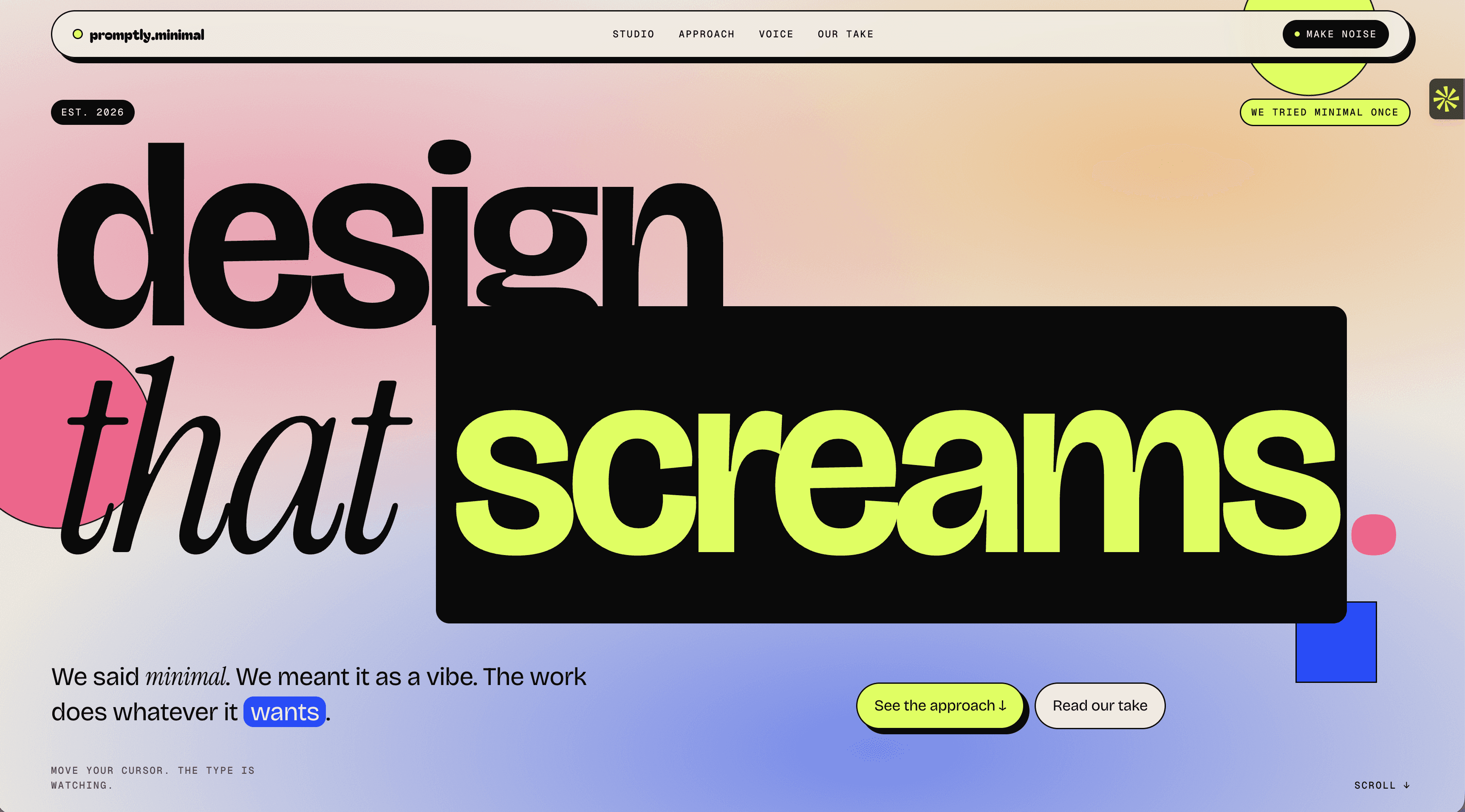
Design that screams. A studio that lied about the minimal part, and made it their whole personality.
Problem
hardly.minimal had a point of view sharp enough to cut glass. What they needed was a website that matched the energy, loud, opinionated, and completely unapologetic. The name was a joke. The work wasn't. The site had to say both at once.
Goals
Build a web presence as bold and self-aware as the studio's identity
Create an experience that demonstrates the design philosophy, not just describes it
Attract clients who want to be noticed, and repel the ones who don't
Process
The name became the concept. hardly.minimal said minimal and meant it as a vibe. Every decision on the site leans into that tension: a typeface that stretches and shouts, a palette that picks fights, copy that commits to a stance and doesn't walk it back. Eight loud opinions. No caveats.
Solution
A single-page site built around movement, type, and attitude. Interactive typography that responds to the cursor. A scrolling ticker that never shuts up. A voice system that proves range without losing identity. The whole thing feels like a manifesto that also happens to convert.
Results / Outcome
A site that functions as a portfolio, a filter, and a pitch all at once
Design that earns the room it takes up
The kind of first impression that makes forgettable brands nervous


other projects